Tag Archives: Cheap

Digital Signage with a Raspberry Pi and Google Slides

I have been looking at an easier way to Digital Signage and I just got my first Raspberry Pi.  I figured the low and High def inputs would allow me to strap a rPi on the back of a TV and provide rich content.

I am looking for a opensource, free/very low cost solution that is easy to manage and simple for the people updating it.  I foresee about 10 devices in my future.

I did a lot of reading and found that there are plenty of projects out there already that enable digital signage for the rPi.  I found this site and started down the list.

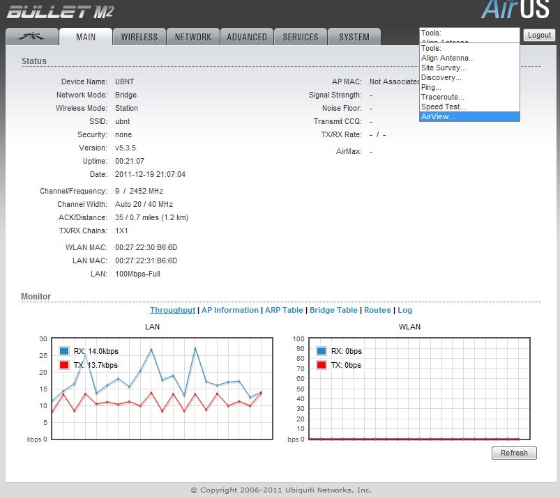
I tried a few applications and liked Screenly the best.  It is simple, performs well, and overall just works.  See their online demo for their interface. They provide their own rPi image or allow installation onto raspbian if you want to further customize it.  SSH is available on the Screenly image out of the box.  Screenly allows web pages, images, and videos (MP4) to be streamed to the rPi which gives me plenty of flexibility to mix and match what I like.  They have 2 versions; a centrally managed model or a free, per device management model.

My immediate thoughts were to convert our ancient overused powerpoint into something more rich, but to get users to buy into this solution I would first convert them over to Google Slides which would provide an easy to use, collaborative, updating presentation to all devices without actually touching any of the devices.

I created a simple Google Slide presentation with four or five slides and random comments on it.  I followed these instructions to make it automatically full-screen and play right in the browser.  I took that link and threw it right into Screenly-OSE and viola!

Caveats…

  • Google sets a single time for all slides…  Therefore you cannot make one slide longer than the others (as far as I can tell).  Transitions can be set differently though.
    • You could leverage second presentation and set the delay longer, or use the Screenly interface to get more specific in necessary.
  • One issue I ran into was that if you have Google loop the presentation rather than Screenly, the content never updates.  Obviously this defeats the purpose of using Google Slides in the first place.  Let Google finish the presentation and let Screenly reload the presentation and it will be fairly straightforward.
    • Related to the above post, then timing becomes an issue.  Some simple math should work to fix that though.
      • 5 seconds a slide (as per when publishing within Google) plus 3 seconds for transition time (as set in presentation) times 5 (number of slides) should come out to be about 40 seconds.  Tweak as needed.

Things to investigate:

It appears the database being used is simply for the ‘Playlist’.  I would imagine that the application would refresh the playlist frequently.  That being said, would placing the /home folder in a shared NFS location make management easier?  This could also lessen the wear and tear of the SDcard.  If all clients pointed back to this NFS share, would this update all of the clients or would this require a reboot/restart on the clients to apply any updates?  I do not know how the software is triggered or written… So more experiments to come when I get more Pi’s!

Cheap spectrum analysis for wireless

When I was going through college for networking I learned to hate wireless.  I had come to learn that it was insecure, unreliable, unpredictable, and difficult to troubleshoot.  I got into a job I love and then the wireless era began.  We are now implemented hundreds of new wireless network devices a year.  We have built out our infrastructure with a lot of time and planning and so far have been quite successful.  We use primarily Cisco equipment with some Ubiquiti back-hauls for some of our outdoor setups.  Cisco provides some very basic spectrum information, for someone who has done some in-depth work with wireless and Cisco this is enough information.  It doesn’t seem to provide any visual representation of the network which can be had to explain to upper management.  Spectrum analyzers can be thousands of dollars and for what we are doing we don’t need something that granular.  We need something to tell use when channels are overloaded/consumed with interference and if antenna’s are aligned properly during setup.

We bought a few Ubiquiti bridges a while back and noticed the AirOS product line has a built in spectrum analysis.  This is handy when selecting channels as it ensures you are not selecting a channel already in use.  We have been watching Ubiquiti for some time now and when we started running into some issues with our client wireless access I went out and bought a Ubiquiti Bullet M5 and an M2.  I think total for the both I paid about $140 (includes adapters and some antennas I had lying around).  As you might guess the M2 runs off of the 2.4Ghz spectrum and the M5 runs off the 5.8Ghz spectrum.  With the Bullets, a switch, and a windows laptop/netbook and power source we can easily run up and diagnose a problem.  This setup is also very mobile and could be brought out into the field to be worked on (barring a power source of course).

At this point in time I have been unsuccessful in getting the spectrum analysis software working in anything other than windows.

I am going to assume you can get the default information for the Ubiquiti Bullet and login.  My bullet is completely stock, no configuration needed to do what I will show you.  After logging in you get some beautiful throughput graphs and other good troubleshooting information.  There is also a drop down menu near the logout button which provides you with an AirView option.  AirView is the spectrum analyzer software.

Screenshot - 02092013 - 01:15:35 PM

Airview is a Java Network Launch Protocol application which obviously requires Java.  The analyzer in my virtual machine runs about 9 frames a second and shows pretty close to real time the actual spectrum.  Here is a 2.4Ghz snapshot of my work where our 2.4Ghz spectrum is very overloaded. Sadly this is with only a few clients in the area.


Screenshot - 02092013 - 01:54:43 PM

The top visual: Waterfall ViewThis is a good representation of channel utilization over time.  You can clearly see if a client is connected and on what channel.

The middle visual: Waveform View
This is a good visual of how often you get a signal at a certain power or signal strength.

The bottom view:  Real-time View
This is good for seeing what is happening right this second compared to the average and maximum power levels recorded.  After letting this run for a few minutes you can compare spikes and hopefully identify any problems.

I plan on using these to make future recommendations to clients and potential trend information over a period of time.  This could help identify possible interferers that could be as simple and intermittent as a microwave.  These pictures will be invaluable when trying to explain to upper management how or why we are having problems, and what should be done to correct it.